Speed Addicts
A Wild Ride on the Fast Track
Once a behind-the-scenes player on Amazon and eBay, I helped Speed Addicts rise from a relatively obscure company to a fully realized brand ecosystem, setting the stage for much bigger things to come and putting them on a track to market dominance.
The following are some highlights:
Shifting (Brand) Gears
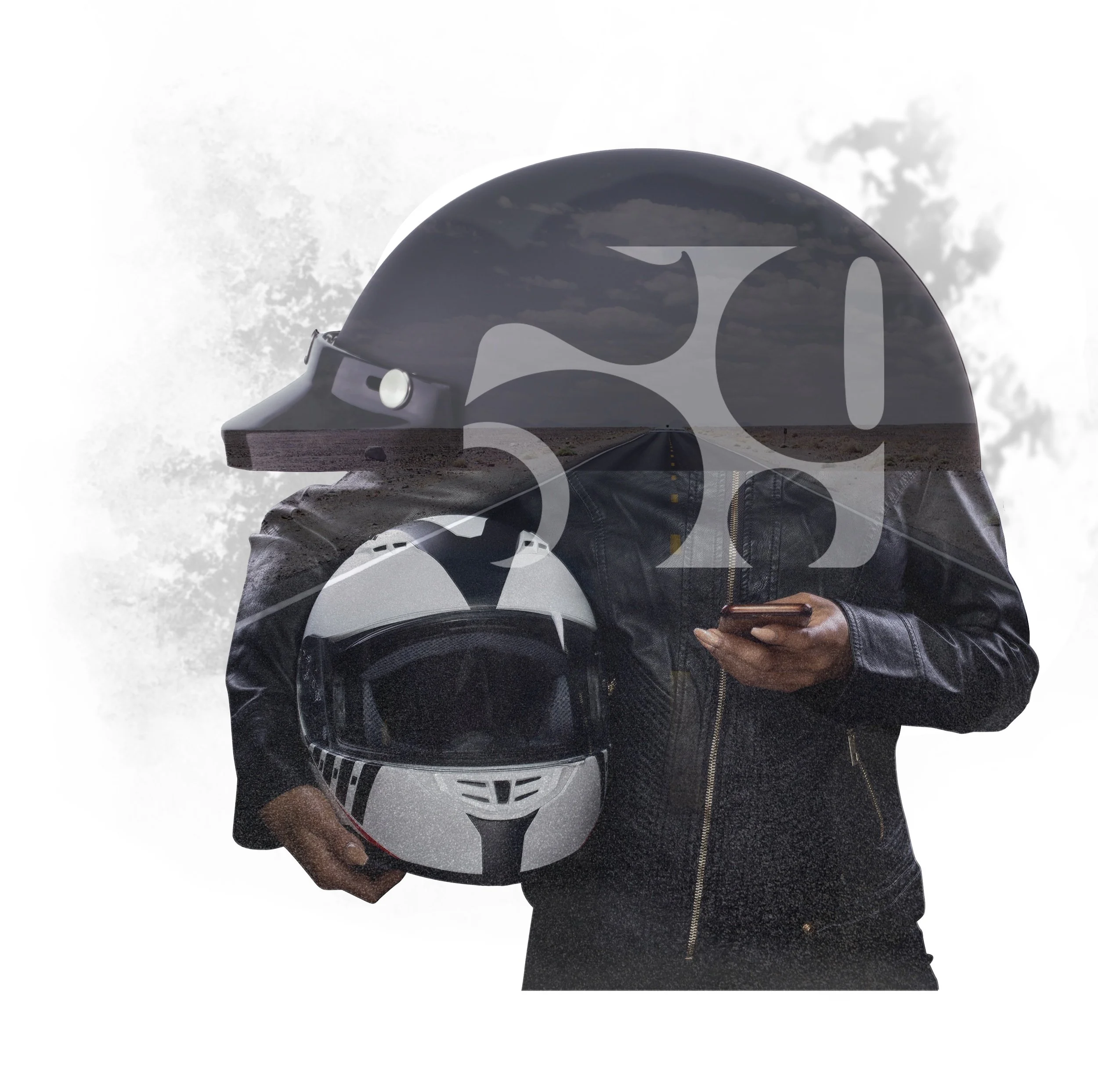
The brand refresh included a logo retool to modernize Speed Addicts' identity. We explored various directions and collaborated with a boutique design house in the PNW specializing in power sports branding. With my close art direction, they delivered a logo that exceeded Schad's, the CEO of Speed Addicts, expectations. We also worked together on additional assets like icons and motion graphics for our YouTube content.
Gaining in Site
At the heart of Speed Addicts' business is their website, which serves as the primary touchpoint for customers. While the existing site was performing well, it was clear that both a visual update and a backend overhaul were needed to keep pace with the evolving brand. My role in this project was to seamlessly integrate the new visual identity into the website's design, ensuring that the refreshed brand aesthetic carried through every aspect of the user experience. I began by developing a comprehensive design brief, outlining key objectives and identifying potential challenges. Through extensive wireframing and mockups, I collaborated with the team to refine the structure and visual direction. The final design strikes a balance between Speed Addicts' modernized visual language and the practical functionality customers expect from the site, delivering an engaging and reliable experience.
previous site design
Changing the Image
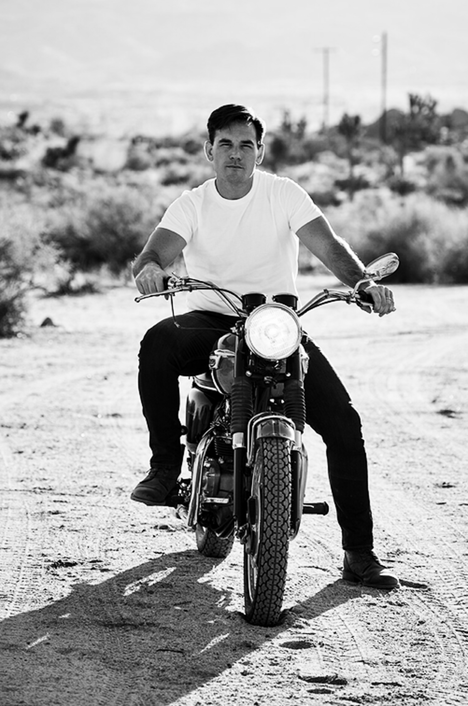
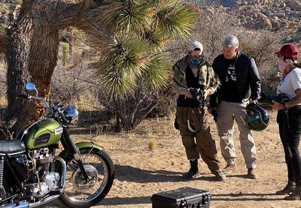
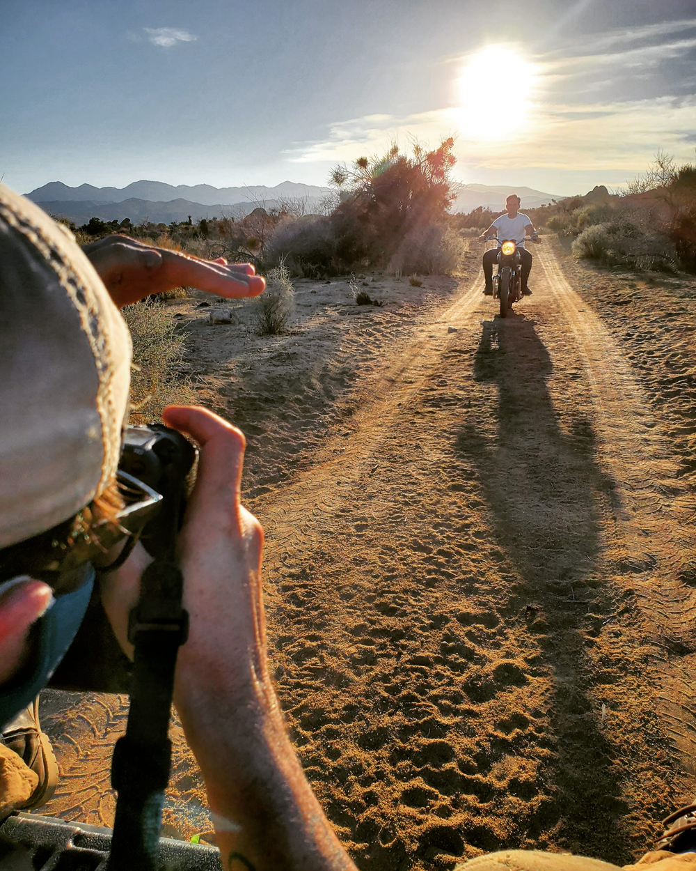
One of the asks from Speed Addicts was to refresh the CEO’s photo assets that would be used on the site and for PR purposes. I brought in Los Angeles-based photographer, Daniel Bergeron, to do a location shoot in Joshua Tree. We secured access to some private land and Schad, the CEO, trailered in his grandfather’s fully restored 1960’s era Triumph. Daniel usually works with Hollywood and music A-listers, and I knew he would get the shots and manifest the look&feel outlined in the creative brief.
Once the new ident was solidified, Speed Addicts needed bumpers created to act as bumpers for the product review videos. I worked up storyboards and animation tests and worked with the ident house to create the bumpers. They capture the tenor and tone of the new visual direction and overall brand refresh perfectly.
*lower your volume before playing, it’s punchy
The Ides of Merch
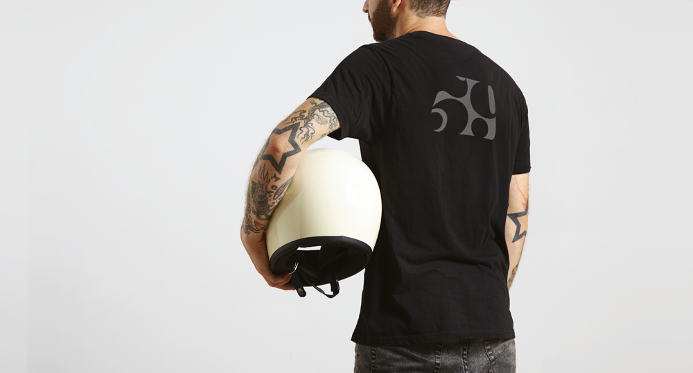
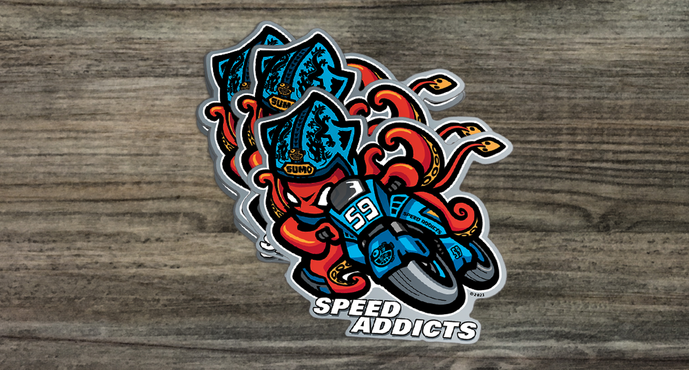
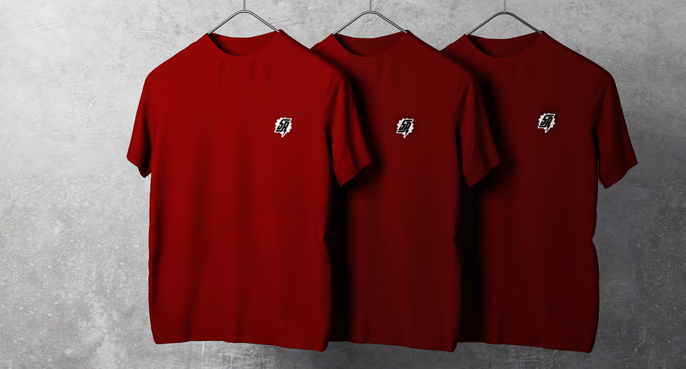
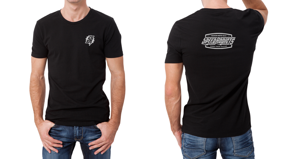
Along with the new ident, and new look and feel for the site and videos, the company needed new branded merch. I tapped well-known Bay Area illustrator SumoFish to create his take on the concept of a ‘moto squid’ (in the moto world the term ‘‘squid’ refers to a rider who rides without the proper gear). SumoFish has a bold and colorful graphical style and tone to his work. He really nailed it. Speed Addicts will be showcasing other illustrators’ work in the near future, and the idea is to grow the catalog of shirt and decal designs. We also integrated the ‘59’ ident into some items, in addition to the standard logo’d T’s and hoodies.
Building a Secret Clubhouse
The YouTube set for Speed Addicts aimed to convert their Orange County business park lobby into a versatile video production set. It needed to serve both as a professional backdrop for product showcasing and review videos and as a retail space in between shoots. To avoid a cold corporate feel or a garage-like atmosphere, we envisioned a stylized clubhouse environment with wood-clad walls and motorsport memorabilia. The focal point was a dynamic stripe created by three horizontally arranged flatscreens behind a narrow reveal in the wood paneling. This stripe allowed for fitted imagery and motion graphics during product reviews and showcased motorcycle-related content in the retail setting. Carefully planned lighting, including cine-grade LED tubes and panels, integrated into the key lights to create a captivating ambiance. The final result surpassed expectations and became the visual backbone for the monthly video production.
